Have you completed your 2020 Census forms yet? In mid-March, homes across the country began receiving invitations to complete the 2020 Census.
Data from the Census determines congressional representation and where federal resources are directed. It also provides important data that shows both the current status of our nation, and significant changes that have occurred over decades and centuries. Researchers use Census data to study social and economic life, and geographers use it to make maps. In fact, if you need help accessing Census data for visualization, check out our data reference services at the Map Center.
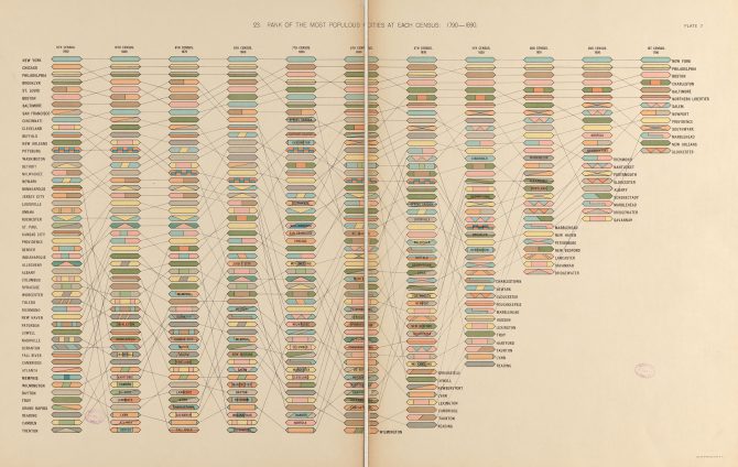
There are many maps and visualizations created using census data in the collection at the Leventhal Map & Education Center. One of our favorites is this unique diagram from the Statistical Atlas of the United States. The Statistical Atlas was produced in 1893, following the 11th Census, which had been taken in 1890. It was one of the first to show Census results using what we now call data visualization techniques.
This chart lists major cities from the highest to lowest populations, from New York City to Trenton, New Jersey. Starting in the column on the right (a close up is shown below), a line traces the rise and fall of each city's population over time.
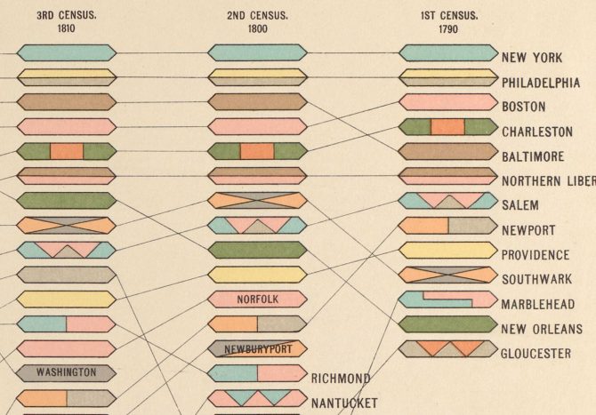
New York City has always been the nation’s largest city, from the 1790 Census through 1890—and it still is today. But there are cities in the top ranks listed in the early years that are surprising today. Gloucester and Marblehead, Massachusetts, are both included in the top thirteen populous cities that year. Nantucket was the 15th largest city in the country in 1800, partly because many whale crews were counted there for Census purposes.
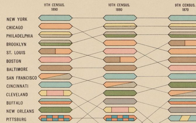
The image above is a close-up of the last column on the left, showcasing the most populous cities in 1890. Chicago joined the ranks in 1850 and astonished the world with its meteoric growth, which was fueled by its location at the crossroads of rail and river corridors. It grew from 4,470 people in 1840 to 29,963 in 1850. By 1890, it had grown to become the second largest city in the country. To explore more of this graphic, click here.
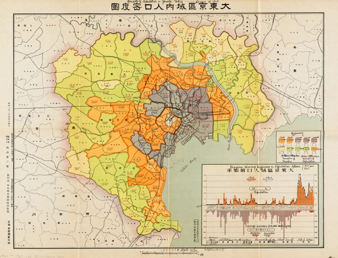
Census data is collected by countries all over the world. For example, the choropleth map below depicts population data from the Tokyo 1926 Census. The dark purple shows a dense population in the city center, versus lower population densities on the outskirts of the city (indicated by yellow and light green). Look for the original in our next exhibition, Bending Lines: Maps and Data from Distortion to Deception. This map is featured as an example of how cartographers have developed visual methods to display quantitative information on a map. A map like this, which uses color to show values, is called a choropleth map, and, though these types of maps are familiar to us today, they only became popular and recognizable towards the end of the nineteenth century.
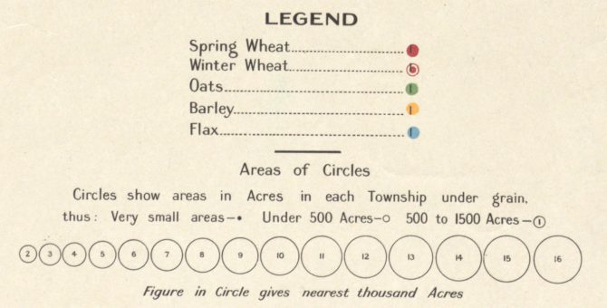
Below, The Cereal Map of Alberta from Canada, shows another method for visualizing statistical information.
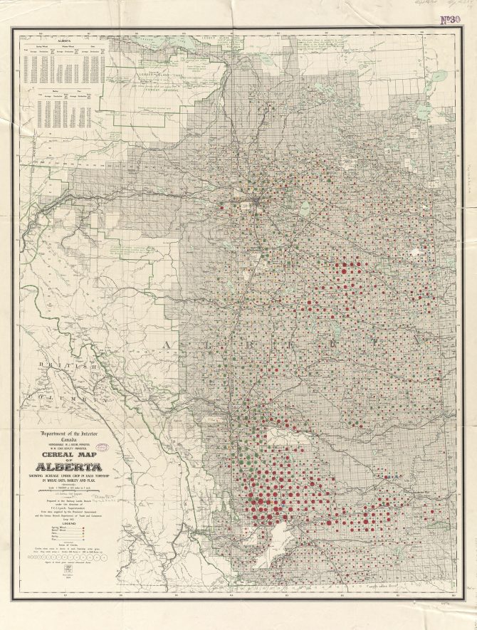
This Canadian map illustrates the acreage of each township. Each crop (wheat, oats, barley, and flax) is denoted by different color circles, the size of the circle indicates how many acres is being used. Below is the map legend that labels the colors and circle sizes.
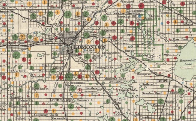
In the image below, there are colored circles indicating high concentrations of oats near Edmonton with some smaller areas of spring wheat and barley. To take a closer look at this map and zoom in on other cities, visit this link. The data for this map is from the Provincial Government and the Department of Trade and Commerce within the Census Branch.
The data collected for the 2020 U.S. Census are set to be released on March 31, 2021. We are looking forward to that date to begin seeing what new and interesting data visualizations will be created! Make sure you’re represented in that data. Learn more about the census process here.

Add a comment to: The Census, Maps, and Data Visualizations